Font In Design

The Importance of Choosing the Correct Font

In the world of design, font is as important as the use of color and images in creating a deliverable product. It is literally the part of a design that conveys the message of a piece and often times, in the case of good design, goes unnoticed to the casual viewer. Designers have a way of seeing things differently though. Typographers and designers in general have a way of nitpicking at the use of fonts and typefaces in their surrounding environments (at least I do). Often times it’s in a negative manner such as sighing at the use of Comic Sans in a newspaper article or Papyrus on the cover of a book (DON’T EVER DO THIS!).

Comic Sans Font

Papyrus Font

Other times though, there is a positive reaction in admiration of a solidly implemented font selection. One such case that is fairly recent is Apple’s development of their new (or is it old?) San Francisco font for the iWatch that is expected to expand to all iOS devices in the near future and maybe even replace their use of the Myriad font. But what goes into selecting the correct font for your project? In all cases it comes down to context. What are you doing with the font? Where is it going to be seen?  Are there brand qualities you are trying to convey?

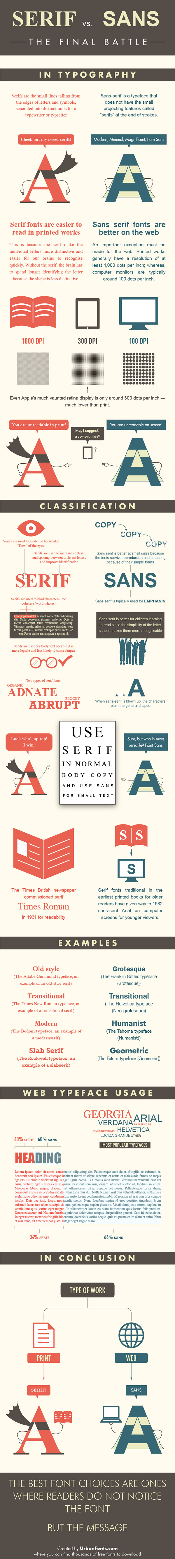
At it’s bare bones font selection often comes down to the choice between  Serif and Sans Serif, a classic rivalry that has waged on for years. It is generally accepted that Serif fonts such as Times New Roman and Charter are used for publishing and print while Sans Serif fonts like Arial and Helvetica are more suited for digital contexts. Luckily, Urbanfonts has taken it upon themselves to make a great, comprehensive guide to further expand on these ideas, going into detail regarding typographic anatomy of each, dpi, and classification, and concluding, as I mentioned at the beginning of this post, that “the best font choices are ones where readers do not notice the font.”

erif-vs-sans-serif

I hope you enjoyed this post about the basic differences in font and the importance of using the right one in your design. In my next post I hope to go into the importance of learning typographic anatomy in order to recognize fonts in the environment and distinguish similar fonts from one another.

Simple Logo Design

Is Your Company’s Logo Hurting You?

A common facet of all types of advertisements and especially logo design is that they rely on simplicity and cleanliness to convey a message. This is generally because the attention span of most people isn’t one that likes to be held captive for long amounts of time. It is also because there are usually limiting factors on advertising and logos, such as space, time, and our ability to retain information. I often see designs where a  designer has tried to meld multiple elements together, or ignored layout basics, and the result is that it just doesn’t work. This is because they are ignoring the basic foundation of a logo design from the start: simplicity and effectiveness from all angles in order to be clean, timeless, and recognizable.  As an example take a look at the image included below that shows the logo progressions of Apple and McDonald’s, two globally recognizable companies, over time.

Apple Logo Progression


McDonald's Logo Progression

As you can see in the case of both companies, the logos have become simpler over time. The final versions of each are able to stand on their own, sans text, thanks to simple shapes which render them clean and recognizable. The fact of the matter is that we are bombarded with logos and other information at an astounding rate daily. It’s estimated that we on average take in 5000+ advertisements per day. Because of this we have a tendency to ignore complicated and convoluted material. A smart simple design such as the finalized versions of both company’s logos is easier to remember and is much more likely to make an impression on someone in the minimal time they may take to look at it.

Notice also that as each became simpler, they did so without straying away from symbols that have become synonymous with their brand. It’s no wonder that as time goes on and social trends change businesses must adapt. However, in adapting it is important to adhere to the things that have gotten you where you are. Imagine if McDonald’s were to all of a sudden change their logo to something completely different like their 1953 logo and began to implement it at locations around your city. There would most definitely be confusion amongst patrons because most people identify McDonald’s with the golden arches. This is the aspect of timelessness in play. Simple logos are easy to redesign as time goes on while remaining easy to identify.

Here are some of our favorite logos at Marketing Gunslingers

IBM Logo Progression Microsoft Logo Progression Starbucks Logo Progression


Spartan Golf Club Logo

A Slideshare Presentation on Social Media Worth Sharing

I thought this slideshare is worth posting on my blog for many reasons:

  1. Shows the adoption of smartphone – not everyone has one yet!
  2. It is about the people and how we use technology – not about the technology
  3. Really great slides that are worth looking at especially if you give prezos frequently!!

Our takeaways:

  1. Customers are interacting with your business socially but not necessarily the way you think they are.
  2. Remember, it is the people and not their devices that actually count.
  3. Mobile does not equal your phone anymore ….

So when spending your hard earned marketing dollars on iPhone ads, remember that is currently less than 3% of the global market.  Remember, it is important to consider context when deciding on your social marketing strategy for your business.