Visual Content Marketing: King Baby!

In the age of infobesity, it’s more important than ever for companies to generate and pump out killer content that stimulates and engages audiences. In fact, seventy percent of marketers have claimed that they are pumping out drastically more content this year than they have in recent years. Without hesitation I can guarantee you that most of the content that will be pushed out will be of a  visual nature. In the constantly evolving landscape of digital marketing, visual content is more important than ever. The advent of ad-blockers has given us an opportunity to rethink how we approach the development of advertisements on the internet, giving reign and incredible importance to visual approaches such as site fabric integrated infographics, videos, comics, photos, memes, and more, and it’s about time. In a recent Forbes article documenting the rise of visual content, it is noted that in “the case of reading, our brain decodes visual information 60,000X faster than text.” Youtube has already surpassed Yahoo and Bing to become the 2nd largest search engine in the world and it’s precisely because visual content and storytelling, again, are more important than ever when it comes to marketing. So, how do marketers take advantage of visual content? What follows is a list of my top 5 visual content webinars from Youtube that you can use to understand, develop and supercharge you visual strategy.

1. Visual Content Marketing: Capture and Engage Your Audience by Marketo

2. Social Media Visual Content Webinar with Guy Kawasaki, Peg Fitzpatrick & Mari Smith! by Mari Smith


3. How to Easily Discover Great Visual Content for Facebook by Post Planner


4. Westchester Digital Summit – Seeing is Believing, The Power of Visual Content by Westchester Digital Summit


5. FORM SF 2014 – Panel: Visual Storytelling by Google Developers

Never Fear. Ad Blocking is Here to Save the Day

ad blocking

Over the last month or so I’ve noticed the recurring topic of ad blocking coming across my usual stream of marketing articles. The subject is usually approached from a panic-mode point of view that sees ad blocking as the latest Y2K style bane of digital marketing, and I’ve got to state right off the bat that I think that is just hilariously silly. Look, I get it. Ad blocking is bad for business, but the rush to condemn it is evidence of the advertising industry’s repetitive self-loathing that occurs whenever something trivial upsets the status quo such as when Facebook cut down on the reach of brand posts last year. It is also evidence that ad blocking is simply a symptom of a much larger problem, bad marketing.

I’ll be forthright and let you know that I use ad blocker pro on my personal computer. And it’s not because I don’t like advertising and marketing. Hell, I do it for a living. It’s because digital advertising over the last few years has become so outrageously sloppy, lazy and egregiously in your face and annoying. Why would I or anyone want to buy  product that interrupts something I’m trying to do? Scroll/pop over adds are the last thing anyone wants to see when they’re on a site trying to do something, and it’s become so prevalent that I have to wonder, “who doesn’t use ad blocking?” Adding onto that, despite what the numbers might show, your targeted ads are creeping out potential customers. There is nothing that bothers me more than being on a website and seeing an add for something I looked up one time and have no interest in whatsoever. So, what is the solution and where does ad blocking fit into the mix?

It starts with the realization that ad blocking was brought about to improve user experience. Once that realization has been made the question becomes, “How can we improve user experience?” As we head into 2016 look for ad blocking to be the catalyst that inspires new creative marketing and ultimately brings about a new chapter in digital advertising. Rather than being complacent and self-loathing I think we as marketers should be thankful that the advent of ad blocking came around because it will push us to develop more quality creative content. Look for advertisements to be more elegantly integrated into the fabric of a site and less of an interruptive nuisance on the face of a site. Look for publishers and social media managers to be more relevant and engaging with their customers. Look for companies to become more humanized and less commercial by realizing social media is a channel and not a strategy. And lastly look for advertisers to really hone in on people who actually want to see their products and services by utilizing ad blocking as the latest tool for trimming the fat from their advertising approach.

How Package Design Affects The Way Our Food Tastes.

One man is leading the charge to research how taste is affected by the way our food looks and sounds.

If you’re paying attention the next time you stroll through a supermarket you might notice how colorful everything is, a botanical garden of plastic wrapped consumerism. You might also notice that your eye is often drawn to a particular package design that is subconsciously appealing to you. Whether it be based on the color or the shape of the package, there is something screaming out to you saying, “look at me. Buy me.” This is effective design and marketing at work. But what if your consumer habits weren’t the only thing influenced by package design? What if the way that that food actually tastes to you was being directly affected simply by the way its packaging looks?

package design 1

In a recent New Yorker article about the multisensory studies of Charles Spence, a professor of experimental psychology at Oxford University, this very idea is explored in a way that could have major implications for the future of package design and marketing. With a team of researchers at Spence’s Crossmodal Research Lab, Spence has been studying how taste can be transformed by color, shape, and sound. As an example, their earliest research suggests that the perceived freshness of a chip can be affected by the pitch of the crunch sound that it makes, or that the sweetness of strawberry mousse is ramped up when served from a white container instead of a black one. With many more experiments revealing similar findings alongside the Western world’s already rampant snack-food craze where food is consumed directly from the package, it’s not hard to see where the potential for major marketing comes into play. Consider for example that for the span of a decade, Spence was part of a research group funded by Unilever where he and his team tested the effects of volume and pitch on perceptions of aerosol sprays.

In 2006, with funding from Unilever, Spence conducted a study to see whether altering the volume and pitch of the sound from an aerosol can would affect how a person perceives the pleasantness or forcefulness of a deodorant. Based on Spence’s findings, the company invested in a packaging redesign for Axe deodorant, complete with new nozzle technology. The underarm spray, which is targeted at young men, now sounds noticeably louder than the company’s gentler, female-targeted Dove brand.

With countless studies under the guidance of Spence revealing similar outcomes it’s easy to see that the future of package design in marketing is as big as it’s ever been and just getting bigger. The important question is how marketers will use it. There is a very real concern surrounding the obesity epidemic in the united states. Making packaging more appealing through the employment of color and shape has already been shown to encourage poor choices with regards to purchasing food. Spence contests that his research could be used for the complete opposite reason though, combatting obesity and promoting health. He has recently been meeting with the U.K. government’s Behavioural Insights Team to discuss how companies could use sensory manipulation through package design to replace some of the detrimental nutritional content of packaged foods.

Read more on Charle’s Spence at The New Yorker


Three Design Trends to Incorporate in Your Site

Last week I broke the news that we here at Marketing Gunslingers are about to go through a major website overhaul. In the 7 days since then we’ve been hard at work doing a lot of market research and introspective thinking regarding the kind of company we are currently and the kind of company we’d like to become. How do you represent those values visually or a website? What do people want to see and know? How do you create something that encourages interaction and challenges the imagination? Well, in our research we noticed 3 major web design trends that we think work well, and that we could learn from in our approach to recreating our brand and our website.

1. Innovative Scrolling

A lot of the websites we visited in our research followed the design trends of utilizing parallax scrolling, color scrolling or horizontal scrolling to bring about effective animation and on single page websites. Simply put, parallax scrolling refers to instances where background images move slower than foreground images, creating depth in a 2D space. There are multiple permutations of how people utilize parallax scrolling and creative scrolling in general, but for brevity we’re going to show you our favorite three.

Design Trend- Parallax1image via http://www.numero10.ch/fr/home/

design trends: color scrollingimage via http://www.like-there-is-no-tomorrow.com/

design trends: horizontal parallaximage via http://biacosta.com/


2. Tiles Everywhere!

In our research we found that most websites are completely unlike our own in regards to being text driven. Rather than text we found that most websites resort to using expandable photo tiles to highlight portfolio, work, and employee pages. It should come as no surprise that in todays world graphics and photo content are more important than ever when it comes to piquing customer interest and interacting with your audience. People want to relate and be able to emphasize with what you do and the easiest for them to accomplish that is to provide them with the means to see that you’re not some mega corporation. You’re a team of individuals all bringing your best to create something special. Here are the three sites we think do that best.

design trends : tiles 1image via http://brainsonfire.com/our-humans/

design trends : tiles2image via http://redhotjoe.com/

design trends : tiles 3image via http://bartonfgraf.com/work/


3. Less is More

At last we reach my favorite of all design trends, minimalism. One of the largest criticisms of our site is that it is far too busy. All the text, framing, widgets, etc. make for a very exhausting experience for visitors to ours or any site. People want simplicity so that they can find out what they want to know through easy navigation. The easiest way to do that is to reduce the amount of confusion by keeping things minimal. Not only are minimal websites aesthetically superior when done correctly, but they make every word that much more important by virtue of being one of few. All that said, here are our favorite 3 examples are sites that perfectly execute what it means to be minimal.

design trends : minimalism1 image via http://truthlabs.com/

design trends: minimalism 2image via http://www.giantstepsmedias.com/

design trends: minimalism 3
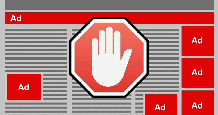
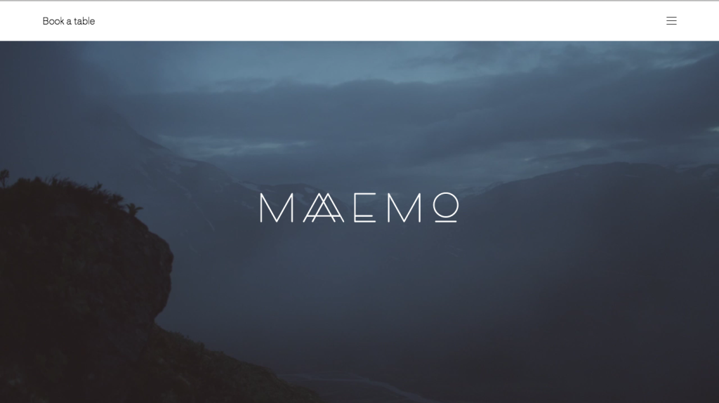
image via http://maaemo.no/


Playing Catch-up in the Realm of Website Design

website design

Over the weekend I went to Chicago to visit my old stomping grounds and see family. I got to do all the things I used to do and never get to do anymore like going to see the World Champion Chicago Blackhawks at the United Center, riding the L downtown to wander around, celebrating the Cubs win in Wrigleyville with complete strangers who quickly became family,etc. I even got to eat at all of my favorite restaurants which is a pretty big deal considering some of them are on completely opposite sides of the city from each other. It was almost the perfect weekend getaway with the exception of my grandmother being ill and the call that I imagine will mark the beginning of my next month or so of work.

How you are perceived as a company relies on a few different things: How you personally interact, socialize, and represent the values of your company, how your company  interacts with the community on social media, and most importantly, what your company’s website looks like. In today’s digitally ruled world, your website is the gateway through which potential clients come to determine whether or not you’re worthy of their business. Sorry to say that if your website looks like a late 90s geocities/angelfire site complete with an animated twinkling background and dancing baby gifs you’re most likely going to lose out on a windfall of clients. Granted, our website isn’t THAT bad, but from an objective point of view it certainly needs a makeover. This right here was the nature of the call I received. We need to rebrand. We need to redesign. We need to reevaluate our goals and values.

Keeping up with an ever evolving digital landscape reminds me of that constantly mentioned gym adage, “It’s easier to stay in shape that to get in shape.” Well, this is us trying to STAY in shape. Over the next few weeks (months?) the MG team is going to be hard at work to bring you a website that you (and we) can be proud of. Our goal is to create something that matches and surpasses the industry standard, taking pointers from established agencies like Sasquatch and Brains on Fire. As the head of creative here the challenge seemed a little daunting after receiving that call, but after letting the dust settle I’ve got to say, I’m pretty exited for this and it’s about damn time. This is what I live for and what I breathe: the opportunity to create and produce something tangible from the inner workings of my mind. It’s going to be a long road, but the resulting website will certainly be worth it.


InnoTech Austin: Free to Students

Let’s be honest. For a lot of people, myself included, college is (was) about partying, football, and procrastinating writing 15 page papers for classes you don’t care about until the day before it’s due. A lot of people don’t take it as seriously as they should until it’s too late. I, for instance, didn’t go get my first internship until the second semester of my junior year when it me that I was about to be a senior with no job experience other than working as an orientation leader for my school. Luckily for me, I managed to stretch my senior year across 4 semesters (12 hour semesters are a breeze) during which I managed to get my act together enough to enter the real world with a decent resume.

Granted, I didn’t see myself ever working for a marketing company, what started as a day by day gig to bridge the gap between undergrad and moving back to Chicago has turned into a career that I’m passionate about, and it was all made possible because I started taking advantage of the resources available to me in college. They say that with age comes wisdom, and while I’m no Martin Heidegger, I’m at least wise enough to know that I should pay it forward.

For the last six years, we at Marketing Gunslingers have been charged with the promotion of Innotech Austin, a yearly conference and exhibition highlighting the region’s innovation and technology development opportunities by showcasing pioneering products and services. InnoTech is the region’s largest business technology event comprised of educational seminars, Special Events (like the Austin Digital Marketing Summit, specifically designed for marketing professionals, the Women in Tech Summit, the HealthTech ATX Summit, the Austin CIO Gala Luncheon & IT Executive Awards, for top level IT professionals), hands-on demonstrations at the InnoTech Exhibits and, of course, limitless networking opportunities (throughout InnoTech and at the many after-parties.) Simply put, if you’re a student who is interested in pursuing a career in digital marketing, IT or tech, InnoTech is the place for you to be to make connections that could possibly benefit your future. I know what you’re thinking. “How am I supposed to afford going to this on a student budget?” That’s where we come in.

For the second year in a row Marketing Gunslingers is proud to bring you a student discount code that gets you complimentary access to the InnoTech exhibition, general lectures, and Microsoft Technology Symposium plus 20% off of The Digital Marketing Summit, the Women in Tech Summit, the HealthTech Summit, and all other secondary events of InnoTech. 

So, if you’re in college and want to do something to prepare you for the real world I highly encourage you to take advantage of this opportunity because it could be something that changes your life and points you in the right direction. Simply follow the link below and register using the discount code at the bottom of the image.

http://www.innotechconferences.com/austin/

InnoTech