Good Logo Design: The Keys to The Kingdom


I’ve talked a lot in the past about design & branding, and more specifically logo design & rebranding, but I don’t think I’ve ever got in depth about what makes for a great logo when rebranding. I guess the first thing to go over before we take a deep dive into this article is to cover some of the reasons why stylistic rebranding is necessary for companies in the first place. The simple answer is that as time continues, and design styles and methodologies reprioritize/popularize themselves in the public eye, other styles become outdated to the point that they don’t elicit an emotional response from the viewer. It could also be due to derivative results of focus group testing where it is found that what a company thought was a strong logo isn’t all that they had hoped. In instances such as these it becomes a necessity to reevaluate the core values of a company and put pen to paper to come up with multiple logo options that seemingly represent those principles in a visually appealing and contemporary style. Sounds easy enough, yea? Not so fast.

Just because someone has a DSLR doesn’t make him or her a photographer. The same is true with design. Many people like to think of themselves as designers (or believe they don’t really need a professional designer) because they have Photoshop, or, God forbid, PowerPoint. It’s an easy trap to fall into, and so many people do it that sometimes it’s hard to spot. A great recent example is Uber’s CEO, who was primarily responsible for the re-design of the widely-criticized Uber app icon. You know the old saying, “if it ain’t broke don’t fix it,” right? Case in point. That being said, we must now consider what does go into good logo design. What follows are five key lessons I’ve learned over the course of my experience:

#1 – Being original isn’t as valuable as being good.  

Of course, originality is an added bonus. Paul Rand, one of the greatest logo designers around (he created logos for IBM, UPS, Westinghouse, Yale University Press, ABC, among others)  once advised not worry so much about being “original,” but to focus on being “good.” This is important to keep in mind when trying to come up with a new logo. That’s not to say that you should take someone else’s idea and put a slight tweak on it to make it your own. Keep in mind that if you can think of it, the Simpson’s have most likely already done it. What I mean is that you should focus on creating something that can stand on its own and worry less about creating something that’s never been done before. A great example of this is Airbnb’s redesign logo being found in a decades-old trademark book a couple years ago. Maybe they took it directly from that book and maybe they didn’t. What matters is that it’s an effective logo that is easily recognizable to the public.

#2 – Don’t stop Sketching.

One of the crucial lessons I learned at the very beginning of my design studies is that good graphic design work must start with a good ideas, and one of the best ways to come up with good ideas is to brainstorm and throw all of your ideas onto paper. The more you brainstorm, the better your ideas get and the closer you are to finding the right solution.


#3 – Context is everything.

One day, your logo may need to be blown up on the side of a large truck or on a billboard. It’s almost guaranteed that it will need to shrink down to less than 1 inch on someone’s business card too, so, it’s important that a logo be versatile so that it looks great no matter the context. Logo Designthat works well at both extremes—extremely large and extremely small—is important. If you fail to do that, you’ll come to find that it’ll be time to re-brand sooner than you thought. You also have to think about the audience of the business. Who is the target market? What is the personality of the company (e.g. is it a stern, formal legal firm or a playful, fresh yogurt shop)? Does their customer base exist only in one country, or do they have customers from around the world?

#4 – Logo design should be done in Illustrator and almost nothing else.

This one is easy. Don’t create your logo in any Microsoft Office software; that means no Word, PowerPoint, or Publisher. You shouldn’t even create your logo in Photoshop if I’m being completely honest. The reason why is that these programs aren’t meant for working with vector graphics, and therefore are incapable of creating a simple file that can be scaled to context (remember #3). The chosen tool of almost all designers for logo design is Adobe Illustrator (there are also a few decent alternatives to Illustrator out there).

#5 – Create logo designs that are objectively good by following standard design principles.

Art and artistic quality are largely subjective, or in other words, heavily influenced by personal feelings, tastes, and/or opinions. While certain aspects of graphic design can be somewhat subjective as well, it is much less subjective than art.

A great logo design is not simply subjectively good (e.g. it “looks good” or is “pretty” to a few people). Great logo design is objectively good because it meets the objective of the client which will be using the design work. The client’s objectives and personality are what must define the colors, shapes, typefaces, and other design elements—not what they (or even you) “feel” is good.

So, how do you define the objective? You should work with the client to create a creative brief, and use the answers provided in the brief to make informed decisions about which direction to take.

In other words, when someone asks you “why did you pick that color?” or “why did you pick that typeface?” your answer should not be “because it looks good.” You should be able to point back to the creative brief and the research you’ve done on your client and their market/industry and use that as the basis of your decision making. Regardless of who the client is and what they put in their creative brief, there are general rules you should follow to create a great logo design. Also keep in mind that color and type choice can make or break a design.


Web Design Trends for 2016

trends

Monday’s blog post about the minimal downside of trends like flat design had an effect on me that I’d like to continue to expand upon today. It’s been a bit since I’ve written about design so let’s just say that I’ve become inspired to dive deep into it this week. It’s well known that in our time the internet has developed into a valuable source of quality content. Because of the constantly metamorphosing algorithm of Google and search engines like it,  content is gaining new position every day. It is not far off to say, as I’ve said many times before that content is king. Along with content though, the past few years have also seen a rise in the value of attractive design. Because of this, recent years have seen numerous site owners opt in for high end website graphics that sometimes even supplant the content quality they’re putting out. These sorts of trends have flourished in the last few years and don’t seem to be going anywhere fast, so, with that being said, it’s time to take a look at the top 8 web design trends of 2016.

1. Flat design never get old

As I indicated last week, I’m a big fan of flat design, and despite the downsides that I was able to come up with, it remains one of those trends that just won’t die. No matter how much time goes by, flat design does not get old. If anything, it’s continuously evolving to the point that I would say it’s just reached its prime. The newest form that’s been a hot ticket contains both expansion of devices and screen sizes, and thanks to it, the principle of the flat design isn’t going anywhere soon.

2. Typography

Choosing the right font or typeface has never been an easy decision even for the best designers. Recall the backlash against iOS7 I mentioned last week. It is now harder than ever for designers to make those decisions. Typography, the art and technique of arranging type to make written words become more attractive, is in its heyday and  as designers are improving all aspects of design, typography must be included with it. Expect text and typography based design and interaction to explode.

3. Background design with a Fullscreen video

A new rising trend in website design is a homes screen that includes fullscreen video as you can see on sites like BrainsOnFire.com. People have a natural affinity for watching video and having an automatically loading background video will definitely catch the visitor’s attention. A background video also heighten the value of the website.

4. Increased Minimalism

If you’ve ever read one of my design articles before, you’ll know that I’m a big fan of minimalism, and it’s not just because I love Donald Judd. As both responsive design and flat design continue to surge, minimalism will need to increase to make UI and UX experiences simple for users. For people who don’t know minimalism, this is a trend in sculpture and painting that arose in the 1950s and used simple, typically massive, forms. A website with complicated or cluttered design is off putting and aggravating. This alone is why minimalism is becoming more important, and why you don’t see the busy Angelfire and Geocities sites of the early 2000s anymore. Minimalism will affect both user experience and conversion rate for your website. Speaking of responsive design…

5. Responsive design

Similar to flat design, responsive design is the best way to satisfy customers who are using desktop browsers. It’s also more preferable when your website doesn’t have it’s own app for browsing. Even old age websites are changing to responsive design, along with other prominent current websites. A responsive design also increases the loading speed several times over, so there’s no reason for not making your website unresponsive anymore.

6. Mobile apps design

As I just briefly implied, multiple websites have taken to creating their own apps to make mobile browsing easier. With the dominance of both mobile apps and social media, a tremendous amount of traffic now comes through mobile phones, making mobile app development and design necessary.

7. Storytelling

Storytelling is nothing new when it comes to web design and creating quality content. It’s one of those trends that’s been around forever and will continue to thrive after making adaptations to the the current landscape. Storytelling, as its name tells everything, content is the true king. You can hook your customers through emotional or attractive stories. As old as it is, engaging and emotional stories with a great design and content will continue to surge as one of the top trends of 2016.

8. Card based design

A card based design website, like an order of applications in Windows Phone or Windows OS will categorize separate block for content making everything more navigable. It’s something that a lot of people have complained about in recent years, but I suspect that is only because its implication has interrupted the status quo of what people were comfortable with, much in the same way that people feel when they switch from PC to Apple and have to learn all the new gestures and keyboard tricks. I for one believe it is more appealing, and it can show a lot more information more quickly than other formats. Pinterest is the best example for card based design

The Limited Downsides of Flat Design

flat design switch

The last 3 years have seen numerous companies follow a trend and make a dramatic switch to flat design in their attempts to revamp their brand. From Netflix to Google and more, the big players are all making the move to a style that is generating a lot of attention, and while flat design merely seems a trend at the moment, I think it’s here to stay. The benefits that come with the simplicity of flat design are simply too numerous to ignore. In fact, they are so numerous and have been written about so often that it’s made me think that maybe it’s time that someone look at at the negatives, and that’s what this post is going to be. Now, this is not to say that I don’t personally prefer flat design, because I do. I just think it would be interesting to see the other side of things. So, before we move on, it’s important to realize what flat design is. “Flat design,” overall, is just a buzzword that encompasses a wide range of more specific elements, but at the core it really means that your design focuses more on the content and interaction instead on decorative elements which try to mimic the real world.  By taking this approach, flat design set’s a lot of bandwidth and design resources free to use for more important things like meaningful animations that help the user understand context or big and beautiful images that help to tell a story. It also gives the designer much more time to think about those things. But again, there are negative that come with every positive.

Cons of Flat Design

  • It’s Trendy

The thing that comes with trends is that you never know how long a trend will last. I stated earlier that I think flat design is here to stay, but I’m no psychic so I cannot say for sure that it will. Already we are beginning to see more of a move from purely flat design to almost flat design or flat design using long shadows. If you reinvent your website or app frequently, trendy design may be for you. If you want a website that has a long shelf life, consider something a little less “in the moment.”

  • Usability Concerns

When it comes to designing complex user experiences and interfaces, flat design can sometimes actually be too flat and look uninteresting. Not all users are comfortable with the style of an interface and don’t always know what or where to click, so if your design elements fall too flat this could create major usability issues. An analysis by the Norman Nielsen Group found that flat design styles can hinder usability because users don’t always know what is clickable. Further, flat design projects tend to include less “information density” in an effort to keep it simple.

  • Color Palettes Can be Tough to Match

The more colors you use in a project, the tougher it can be to match them properly. Creating a harmonious color palette is a challenge on its own, and can be even more challenging when you add four, five or more colors. Designers who create the most successful flat color palettes tend to stick to a uniform look in terms of saturation and brightness so color choices look intentional.

  • Weak Typography Becomes More Obvious

Just as flat design helps create a focus on good typography, it can really make bad typography stand out as well. (Just look at all the flack Apple received after previewing iOS 7 with an ultra-thin primary typeface.) Flat design is very unforgiving when it comes to boldness. Every choice has some degree of drama, making it hard to hide weak typography. If you are not comfortable pairing or selecting fonts, flat design may not be the best option.

  • It Can Look Too Simple

Depending on the use, flat design has been called “too simple” by some.It can be difficult to convey a complicated visual message in flat design.The other argument against flat design is the simplicity of user-interface tools. Proponents of skeuomorphic design say embellishments that add a sense of realism make tools easy to use. Frankly, it depends on the context.Visual hierarchy can also be a concern with super-simple interface designs. What is most important? How do you emphasis it visually?

  • Some Decoration Can be Good

Not all decoration is bad. Flat design truly limits the number of tricks you can use if you want the project to be truly flat.

4 Qualities of A Bad Design Client

Design Client

Every designer has gone through the following scenario at some point. You get a new design client for some work. It may be for an app, a website, business collateral or a logo/branding overhaul. The work is pretty straightforward after you get to know the client a little bit and understand the values of the company or business entity, and what they are looking for. You grind away on the project, and finish with what you think is close to a final product. Then comes the feedback loop. For me this includes asking designer friends what they think (provided I haven’t had to sign an NDA) as well as my colleagues. The most important feedback of all comes from the design client though. After all, it’s them who’s lining your pockets. This is where the trouble begins. Despite general positive feedback from others, they aren’t happy with what you’ve done. It’s frustrating, but it’s part of the job, and it’s up to you to fix it. But how much feedback is too much? How far is too far when it comes to criticism and input? As designers, we live and die by our portfolios, so it’s important to know how to recognize a bad design client and cut ties. Here are some of the more obvious character flaws.

Closed Minded

You’ll always come across these people who are set in their ways. They refuse to be open about the most minute changes such as a color swap or font replacement despite delineating a design plan that clearly indicated such changes would be necessary. They often are the type to hover over your shoulder throughout a project, making sure everything is done exactly as they say and usually not accepting of new ideas or creative solutions. In order for a project to be successful, both the designer and client need to be open to compromise. If your client comes across as closed minded it may be time to pull the plug because they’re certainly not someone you want to work with.

Disrespectful

I cannot count the number of times it’s been suggested to me by friends and potential clients alike to do something for free because “it’s just art,” or “it’s just design.” I spent the same amount of time time as everyone else learning the principles and practices of my field so that I could provide a financial means to live my life. To have it discounted by anyone is offensive to me and it should be to other designers as well. A disrespectful design client often sees themselves above you and can be condescending. Don’t work with these people.

Distant

Bad design clients often believe that once they detail the scope of the project, the entirety of its responsibility falls on you, the designer. They refuse to become involved until the very end and often tell you things like, “I trust you,” and “Just take care of it and we’ll review when you’re finished.” No. No. NO. Designers require constant feedback on the process to make sure there is no time wasted on something that will eventually be scrapped. Explaining these points to a client usually results in a mutual understanding with them being willing to play their part, but there will always be the few that are too busy to give you their time.

Unopen to Criticism

Part of designing is being open to criticism at all times. It’s something we learn early on in our careers and eventually learn to utilize to inform and mold our decisions and design styles. That being said, it should be obvious that this same level of maturity and ability to take criticism is expected of any professional. If a design client can’t handle criticism it’s a red flag warning of a bad client. Drawing from the last two points, often times design clients overlook the fact that designers are experts in their field and utilize their artistic expertise to solve problems just like anyone else. That being the case, the same level of deference should be given to a designer’s suggestions as someone would give a lawyer for their council.


For hilarious and horrible real life examples of what it’s like working with a bad design client please visit clientsfromhell.net/ 


How Package Design Affects The Way Our Food Tastes.

One man is leading the charge to research how taste is affected by the way our food looks and sounds.

If you’re paying attention the next time you stroll through a supermarket you might notice how colorful everything is, a botanical garden of plastic wrapped consumerism. You might also notice that your eye is often drawn to a particular package design that is subconsciously appealing to you. Whether it be based on the color or the shape of the package, there is something screaming out to you saying, “look at me. Buy me.” This is effective design and marketing at work. But what if your consumer habits weren’t the only thing influenced by package design? What if the way that that food actually tastes to you was being directly affected simply by the way its packaging looks?

package design 1

In a recent New Yorker article about the multisensory studies of Charles Spence, a professor of experimental psychology at Oxford University, this very idea is explored in a way that could have major implications for the future of package design and marketing. With a team of researchers at Spence’s Crossmodal Research Lab, Spence has been studying how taste can be transformed by color, shape, and sound. As an example, their earliest research suggests that the perceived freshness of a chip can be affected by the pitch of the crunch sound that it makes, or that the sweetness of strawberry mousse is ramped up when served from a white container instead of a black one. With many more experiments revealing similar findings alongside the Western world’s already rampant snack-food craze where food is consumed directly from the package, it’s not hard to see where the potential for major marketing comes into play. Consider for example that for the span of a decade, Spence was part of a research group funded by Unilever where he and his team tested the effects of volume and pitch on perceptions of aerosol sprays.

In 2006, with funding from Unilever, Spence conducted a study to see whether altering the volume and pitch of the sound from an aerosol can would affect how a person perceives the pleasantness or forcefulness of a deodorant. Based on Spence’s findings, the company invested in a packaging redesign for Axe deodorant, complete with new nozzle technology. The underarm spray, which is targeted at young men, now sounds noticeably louder than the company’s gentler, female-targeted Dove brand.

With countless studies under the guidance of Spence revealing similar outcomes it’s easy to see that the future of package design in marketing is as big as it’s ever been and just getting bigger. The important question is how marketers will use it. There is a very real concern surrounding the obesity epidemic in the united states. Making packaging more appealing through the employment of color and shape has already been shown to encourage poor choices with regards to purchasing food. Spence contests that his research could be used for the complete opposite reason though, combatting obesity and promoting health. He has recently been meeting with the U.K. government’s Behavioural Insights Team to discuss how companies could use sensory manipulation through package design to replace some of the detrimental nutritional content of packaged foods.

Read more on Charle’s Spence at The New Yorker


Three Design Trends to Incorporate in Your Site

Last week I broke the news that we here at Marketing Gunslingers are about to go through a major website overhaul. In the 7 days since then we’ve been hard at work doing a lot of market research and introspective thinking regarding the kind of company we are currently and the kind of company we’d like to become. How do you represent those values visually or a website? What do people want to see and know? How do you create something that encourages interaction and challenges the imagination? Well, in our research we noticed 3 major web design trends that we think work well, and that we could learn from in our approach to recreating our brand and our website.

1. Innovative Scrolling

A lot of the websites we visited in our research followed the design trends of utilizing parallax scrolling, color scrolling or horizontal scrolling to bring about effective animation and on single page websites. Simply put, parallax scrolling refers to instances where background images move slower than foreground images, creating depth in a 2D space. There are multiple permutations of how people utilize parallax scrolling and creative scrolling in general, but for brevity we’re going to show you our favorite three.

Design Trend- Parallax1image via http://www.numero10.ch/fr/home/

design trends: color scrollingimage via http://www.like-there-is-no-tomorrow.com/

design trends: horizontal parallaximage via http://biacosta.com/


2. Tiles Everywhere!

In our research we found that most websites are completely unlike our own in regards to being text driven. Rather than text we found that most websites resort to using expandable photo tiles to highlight portfolio, work, and employee pages. It should come as no surprise that in todays world graphics and photo content are more important than ever when it comes to piquing customer interest and interacting with your audience. People want to relate and be able to emphasize with what you do and the easiest for them to accomplish that is to provide them with the means to see that you’re not some mega corporation. You’re a team of individuals all bringing your best to create something special. Here are the three sites we think do that best.

design trends : tiles 1image via http://brainsonfire.com/our-humans/

design trends : tiles2image via http://redhotjoe.com/

design trends : tiles 3image via http://bartonfgraf.com/work/


3. Less is More

At last we reach my favorite of all design trends, minimalism. One of the largest criticisms of our site is that it is far too busy. All the text, framing, widgets, etc. make for a very exhausting experience for visitors to ours or any site. People want simplicity so that they can find out what they want to know through easy navigation. The easiest way to do that is to reduce the amount of confusion by keeping things minimal. Not only are minimal websites aesthetically superior when done correctly, but they make every word that much more important by virtue of being one of few. All that said, here are our favorite 3 examples are sites that perfectly execute what it means to be minimal.

design trends : minimalism1 image via http://truthlabs.com/

design trends: minimalism 2image via http://www.giantstepsmedias.com/

design trends: minimalism 3
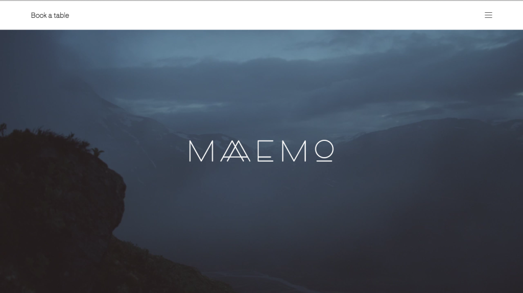
image via http://maaemo.no/