Playing Catch-up in the Realm of Website Design

website design

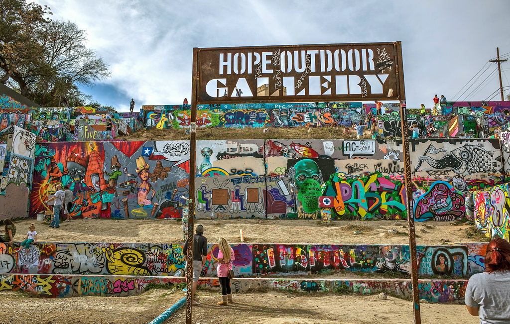
Over the weekend I went to Chicago to visit my old stomping grounds and see family. I got to do all the things I used to do and never get to do anymore like going to see the World Champion Chicago Blackhawks at the United Center, riding the L downtown to wander around, celebrating the Cubs win in Wrigleyville with complete strangers who quickly became family,etc. I even got to eat at all of my favorite restaurants which is a pretty big deal considering some of them are on completely opposite sides of the city from each other. It was almost the perfect weekend getaway with the exception of my grandmother being ill and the call that I imagine will mark the beginning of my next month or so of work.

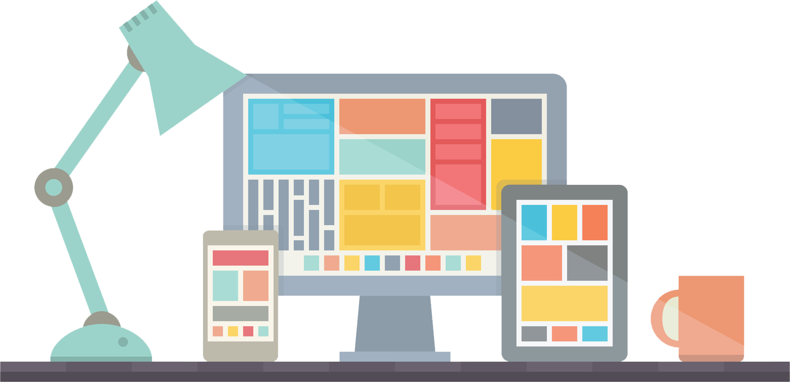
How you are perceived as a company relies on a few different things: How you personally interact, socialize, and represent the values of your company, how your company  interacts with the community on social media, and most importantly, what your company’s website looks like. In today’s digitally ruled world, your website is the gateway through which potential clients come to determine whether or not you’re worthy of their business. Sorry to say that if your website looks like a late 90s geocities/angelfire site complete with an animated twinkling background and dancing baby gifs you’re most likely going to lose out on a windfall of clients. Granted, our website isn’t THAT bad, but from an objective point of view it certainly needs a makeover. This right here was the nature of the call I received. We need to rebrand. We need to redesign. We need to reevaluate our goals and values.

Keeping up with an ever evolving digital landscape reminds me of that constantly mentioned gym adage, “It’s easier to stay in shape that to get in shape.” Well, this is us trying to STAY in shape. Over the next few weeks (months?) the MG team is going to be hard at work to bring you a website that you (and we) can be proud of. Our goal is to create something that matches and surpasses the industry standard, taking pointers from established agencies like Sasquatch and Brains on Fire. As the head of creative here the challenge seemed a little daunting after receiving that call, but after letting the dust settle I’ve got to say, I’m pretty exited for this and it’s about damn time. This is what I live for and what I breathe: the opportunity to create and produce something tangible from the inner workings of my mind. It’s going to be a long road, but the resulting website will certainly be worth it.


Art Alliance Austin: Keeping the Scene Thriving

Art Alliance Austin
As marketers, advertisers, and designers it goes without saying that art and visual stimuli are important and essential parts of our job. All too often though, I think it is easy to lose track of the importance of art for art’s sake. The art scene in Austin and central Texas, while growing, has still been lacking over the last few years. Thanks to efforts by Art Alliance Austin since 1956 the art culture is becoming larger than ever here as more and more people are enthralled and motivated to fill the void.

Aristotle once said that “The aim of art is to represent not the outward appearance of things, but their inward significance.” That was said thousands of years ago. Yesterday those words were repeated to me over a few cups of coffee by a close friend, Art Alliance Austin member, and local street artist, Gobi. He went on to add “a lot of people nowadays don’t get that, especially as technology continues to surge and run our lives. They see something and judge it by its aesthetic qualities and not by its meaning: traditional art, fashion, even people. Everything is face value and instant gratification in today’s world. It feels like we’ve been losing our traditions and our culture…”

No doubt, to a degree he’s right. Luckily for the central Texas region though, there is something being done about it by a group called Art Alliance Austin. In short the Alliance aims to preserve the culture of art in Austin and central Texas and works to promote the public’s involvement in it. As a member myself, I can attest that because of the Alliance’s efforts, leaps and bounds have been made to get art back on the map in the last few years.

Art Alliance Austin was started in 1956 as The Women’s Art Guild by an enthusiastic group of young women who were anxious to support art in the Austin area and the Laguna Gloria Art Museum. The group was primarily known for throwing Fiesta, a yearly art event which allowed local artists to showcase their work to the public. Originally a small neighborhood gig, tremendous support brought it out of its shell, and it was moved to downtown and was renamed The Austin Fine Arts Festival. Today we know the event as Art City Austin. By 2004 it would rename itself and reestablish its mission statement which now reads:

“Through dynamic collaboration with artists, inclusive engagement of the community, and passionate devotion of our members, Art Alliance Austin is a catalyst for art. We exist to enrich and endow Central Texas’ cultural landscape as well as to promote the participation in visual art”

In the time since then it’s greatly succeeded. Now throwing 4 large events annually that bring in collectors, educators, museums, galleries, and artists from all over the world, Austin has become and is still becoming a cultural hub for art.
Through their persistence and love for art the Alliance has managed to bring us a thriving culture ripe with talent. One such talent is that of my dear friend Gobi.

“If it wasn’t for the Alliance I wouldn’t be doing what I’m doing… or at least not as well as I’m doing.” Gobi, whose real name is Matthew, is a graphic designer and programmer from Florida who has been obsessed with computers from a young age. As he grew up he found programs like Photoshop and Corel Paint to be greatly stimulating but never thought to get his
creations out into the public. “It was just a thing I did to entertain myself. I was primarily building websites for small family run stores or writing code for class because I figured that was what I wanted to do with my life. When I wanted to chill out I would open up Photoshop and just draw stuff on my tablet and save it. Sometimes if I liked it enough I would print it out and hang it on my wall.”

His life changed one day when he was caught drawing on his tablet during a lecture by a professor who happened to be a member of the Alliance. “She wasn’t even mad. She just said that’s really interesting stuff, scribbled out a URL and told me I should check it out. I did and my life has been different since.” With the help of his teacher and other Alliance members that he came into contact with, he got to display his art to the public during Art Week Austin in 2006. “It
was crazy,” he says. “I was in this tiny booth with a bunch of prints of my stuff that the Alliance helped me out with, and before I knew it, I had sold them all.”

Matt’s story is one that could be repeated by numerous artists in the Austin area. He has since participated in the last 5 Art City Austin festivals. The Alliance serves artists just as artists serve the Alliance. They enrich the area by helping new artists establish themselves and through their events ensure that the public may take notice of the broad spectrum of talent that surrounds them.

There is so much to be appreciated in our world that is slowly being left behind as technology and instant-gratification take over. We labor on the internet day in and day out trying to bring customers to our businesses and it’s easy to be overwhelmed and take for granted the things that make our lives enjoyable. So, let’s not lose our ability to recognize the inward significance of things like art and the art culture. Let’s side with the Alliance and keep people involved and aware of the rich culture that surrounds them. As influencers on the web with superior access we owe it to ourselves to do that.

“Art is much less important than life, but what a poor life it is without it.”-Robert Motherwell.

Typeface Anatomy

Learning Typeface Anatomy Can Help You Become a Better Designer


Last week I briefly discussed the importance of font/typeface in design and using the correct font for the desired message. If you took a look at the included infographic, or have ever used a computer before you most likely now have a pretty clear idea of the differences between a serif and sans-serif  font.  Today I’m going to take that a step further and talk to you about typeface anatomy.


Typeface Anatomy Difference


Typeface Anatomy Difference 2


Everyone can tell the difference between the two fonts used by the apartment complex in the first photograph above. Very obviously, one is a serif font while the other is a san-serif, but how would someone who is less experienced know the difference between two similar fonts such as in the second image? They’re both bracketed serif fonts that have teardrop terminals and double-story Gs. The most obvious giveaway is the angle of their upper serifs and the lack of a bilateral serif on the K in the second example. Did any of those terms confuse you? Don’t worry if they did. I’ll be providing a basic guide to typeface anatomy shortly. Also, for anyone wondering, the top is Times New Roman and the bottom is Georgia.

It’s important for designers of both print and digital media to be able to recognize the smallest differences between fonts like this. Developing a vocabulary of basic typeface anatomy  informs good decisions, and allows designers to recognize typefaces and fonts in the wild that they can go on to use in their own work. I should note that it isn’t absolutely necessary to memorize the entire list of typeface terminology, but familiarizing yourself with some of the basic concepts and doing your best to pick them out of typefaces/fonts on your own is a great way to train you eye, and make yourself a more effective designer.


Typeface Anatomy: Arm

Arm

The arm of a character is any upper or lower stroke, either horizontal or slanted that connects to the rest of the character body on one end but not on the other


Typeface Anatomy: Ascender

Ascender

An ascender is the part of lowercase letters such as t, d, f, h, k, l, and b which extends upwards past the x-height.


Typeface Anatomy: Bar

Bar

A bar is a horizontal stroke in letters such as R, t, A, f, H, and e.


Typeface Anatomy: Bowl

Bowl

The bowl of a character is a curved stroke which created a closed space within a letter such as R, P, d, and b.


Typeface Anatomy: Caps Height

Caps Height

Caps Height is the height of a capitalized letter from the baseline to the top of the character.


Typeface Anatomy: Counter

Counter

A counter is a closed space within a character such as in the letters q, Q, R, O, o, P, p, a, A, d, D, g, b, and B.


Typeface Anatomy: Descender

Descender

Descenders are the parts of lower case characters like q, y, p, j, and sometimes g depending on the font, that extend below the baseline.


Typeface Anatomy: Ear

Ear

The ear is the small protruding stroke attached to the top of a lowercase g.


Typeface Anatomy: Link

Link

A link is the part of a lowercase double-story g that connects the two bowls.


Typeface Anatomy: Loop

Loop

A loop refers to the bottom bowl of a double-story g


Typeface Anatomy: Serif

Serif

A serif is a stroke protruding from the ends of the major strokes with make up a letter. There are two kind of serifs: bracketed and unbracketed. Bracketed serifs have supporting curves that connect the stroke to the serif such as in the example to the right. Unbracketed serifs rather, are attached at 90 degree angles.


Typeface Anatomy: Shoulder

Shoulder

The shoulder is a curved stroke that advances downward from the stem in letters like h, n, and m.


Typeface Anatomy: Spine

Spine

The spine is the main curved stroke of an S.


Typeface Anatomy: Spur

Spur

A spur is a small protrusion away from the main stroke of a capital G.


Typeface Anatomy: Stem

Stem

The steam is the main, usually vertical stroke of a character.


Typeface Anatomy: Stress

Stress

Stress refers to the direction of thickening in a curved stroke. It is most often seen in characters that have counters and bowls.


Typeface Anatomy: Stroke

Stroke

A stroke is a straight or curved diagonal line that is separate from the stem such as in N, M, or Y. In characters that have two diagonals such as A and v, the first line is the stem and the next, the stroke.


Typeface Anatomy: Swash

Swash

A swash is a decorative replacement for a terminal or serif that is often found in script style typefaces. They are often used to indicate the beginning of a sentence or paragraph.


Typeface Anatomy: Tail

Tail

A tail is a term referring to the descender of letters like Q and sometimes R and K. Often decorative, a tail can also be used to describe the descenders of the characters j, g, y, q, and p depending on the font used.


Typeface Anatomy: Terminal

Terminal

The terminal is the end of a stroke which does not include a serif.


Typeface Anatomy: Tittle

Tittle

A tittle, also know as a dot, is the small mark above the letters j and i.


Typeface Anatomy: X-height

X-Height

X-height refers to the height of lowercase letters, most notably x, without including ascenders or descenders.

Font In Design

The Importance of Choosing the Correct Font

In the world of design, font is as important as the use of color and images in creating a deliverable product. It is literally the part of a design that conveys the message of a piece and often times, in the case of good design, goes unnoticed to the casual viewer. Designers have a way of seeing things differently though. Typographers and designers in general have a way of nitpicking at the use of fonts and typefaces in their surrounding environments (at least I do). Often times it’s in a negative manner such as sighing at the use of Comic Sans in a newspaper article or Papyrus on the cover of a book (DON’T EVER DO THIS!).

Comic Sans Font

Papyrus Font

Other times though, there is a positive reaction in admiration of a solidly implemented font selection. One such case that is fairly recent is Apple’s development of their new (or is it old?) San Francisco font for the iWatch that is expected to expand to all iOS devices in the near future and maybe even replace their use of the Myriad font. But what goes into selecting the correct font for your project? In all cases it comes down to context. What are you doing with the font? Where is it going to be seen?  Are there brand qualities you are trying to convey?

At it’s bare bones font selection often comes down to the choice between  Serif and Sans Serif, a classic rivalry that has waged on for years. It is generally accepted that Serif fonts such as Times New Roman and Charter are used for publishing and print while Sans Serif fonts like Arial and Helvetica are more suited for digital contexts. Luckily, Urbanfonts has taken it upon themselves to make a great, comprehensive guide to further expand on these ideas, going into detail regarding typographic anatomy of each, dpi, and classification, and concluding, as I mentioned at the beginning of this post, that “the best font choices are ones where readers do not notice the font.”

erif-vs-sans-serif

I hope you enjoyed this post about the basic differences in font and the importance of using the right one in your design. In my next post I hope to go into the importance of learning typographic anatomy in order to recognize fonts in the environment and distinguish similar fonts from one another.

Simple Logo Design

Is Your Company’s Logo Hurting You?

A common facet of all types of advertisements and especially logo design is that they rely on simplicity and cleanliness to convey a message. This is generally because the attention span of most people isn’t one that likes to be held captive for long amounts of time. It is also because there are usually limiting factors on advertising and logos, such as space, time, and our ability to retain information. I often see designs where a  designer has tried to meld multiple elements together, or ignored layout basics, and the result is that it just doesn’t work. This is because they are ignoring the basic foundation of a logo design from the start: simplicity and effectiveness from all angles in order to be clean, timeless, and recognizable.  As an example take a look at the image included below that shows the logo progressions of Apple and McDonald’s, two globally recognizable companies, over time.

Apple Logo Progression


McDonald's Logo Progression

As you can see in the case of both companies, the logos have become simpler over time. The final versions of each are able to stand on their own, sans text, thanks to simple shapes which render them clean and recognizable. The fact of the matter is that we are bombarded with logos and other information at an astounding rate daily. It’s estimated that we on average take in 5000+ advertisements per day. Because of this we have a tendency to ignore complicated and convoluted material. A smart simple design such as the finalized versions of both company’s logos is easier to remember and is much more likely to make an impression on someone in the minimal time they may take to look at it.

Notice also that as each became simpler, they did so without straying away from symbols that have become synonymous with their brand. It’s no wonder that as time goes on and social trends change businesses must adapt. However, in adapting it is important to adhere to the things that have gotten you where you are. Imagine if McDonald’s were to all of a sudden change their logo to something completely different like their 1953 logo and began to implement it at locations around your city. There would most definitely be confusion amongst patrons because most people identify McDonald’s with the golden arches. This is the aspect of timelessness in play. Simple logos are easy to redesign as time goes on while remaining easy to identify.

Here are some of our favorite logos at Marketing Gunslingers

IBM Logo Progression Microsoft Logo Progression Starbucks Logo Progression


Spartan Golf Club Logo