Last week I broke the news that we here at Marketing Gunslingers are about to go through a major website overhaul. In the 7 days since then we’ve been hard at work doing a lot of market research and introspective thinking regarding the kind of company we are currently and the kind of company we’d like to become. How do you represent those values visually or a website? What do people want to see and know? How do you create something that encourages interaction and challenges the imagination? Well, in our research we noticed 3 major web design trends that we think work well, and that we could learn from in our approach to recreating our brand and our website.
1. Innovative Scrolling
A lot of the websites we visited in our research followed the design trends of utilizing parallax scrolling, color scrolling or horizontal scrolling to bring about effective animation and on single page websites. Simply put, parallax scrolling refers to instances where background images move slower than foreground images, creating depth in a 2D space. There are multiple permutations of how people utilize parallax scrolling and creative scrolling in general, but for brevity we’re going to show you our favorite three.
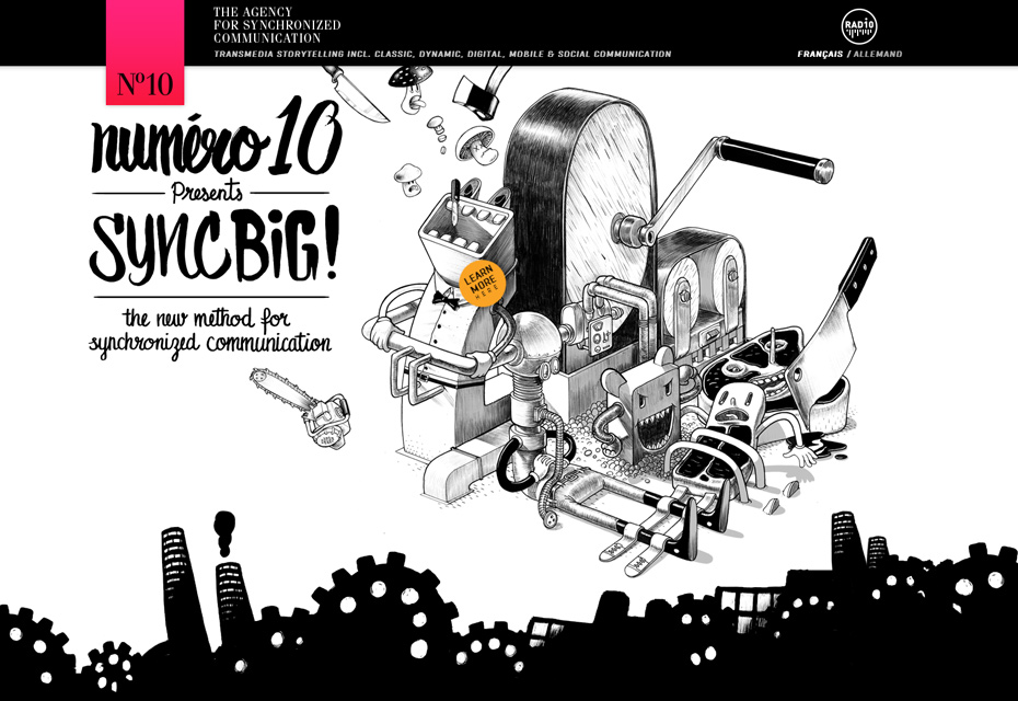 image via http://www.numero10.ch/fr/home/
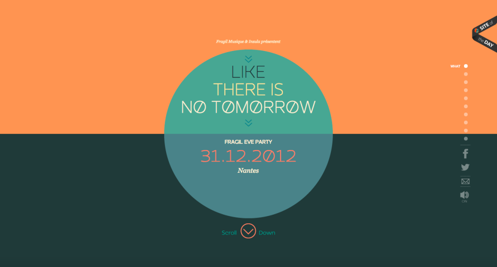 image via http://www.like-there-is-no-tomorrow.com/
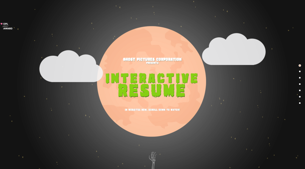 image via http://biacosta.com/
2. Tiles Everywhere!
In our research we found that most websites are completely unlike our own in regards to being text driven. Rather than text we found that most websites resort to using expandable photo tiles to highlight portfolio, work, and employee pages. It should come as no surprise that in todays world graphics and photo content are more important than ever when it comes to piquing customer interest and interacting with your audience. People want to relate and be able to emphasize with what you do and the easiest for them to accomplish that is to provide them with the means to see that you’re not some mega corporation. You’re a team of individuals all bringing your best to create something special. Here are the three sites we think do that best.
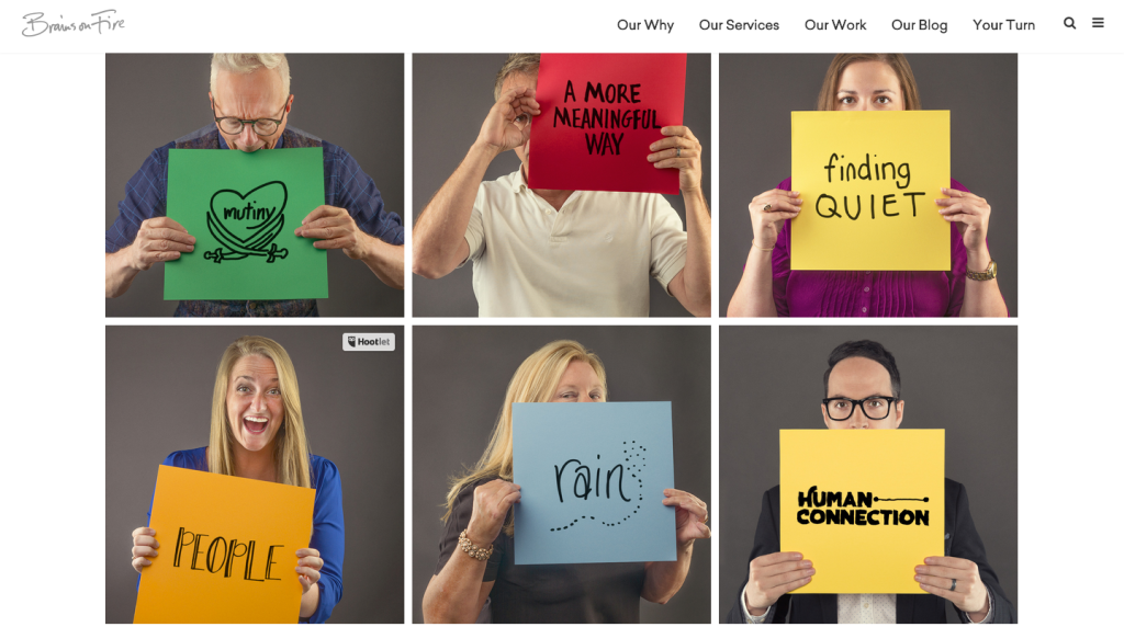 image via http://brainsonfire.com/our-humans/
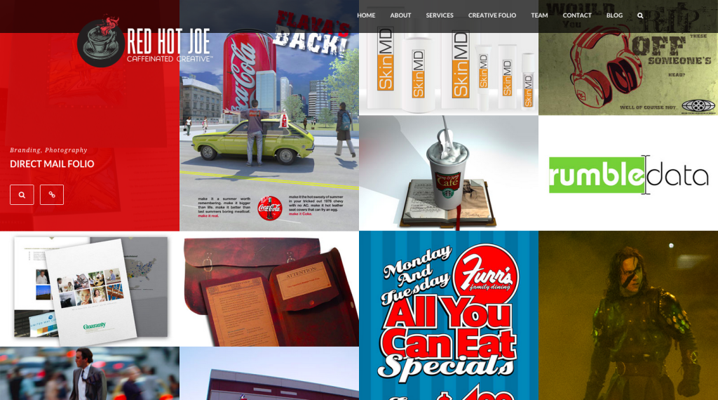 image via http://redhotjoe.com/
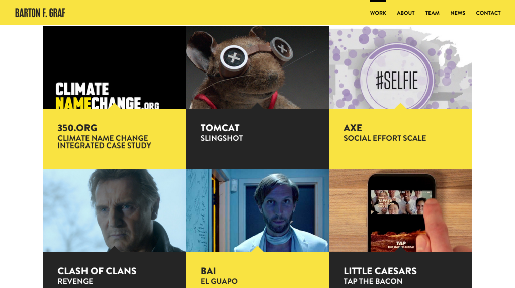 image via http://bartonfgraf.com/work/
3. Less is More
At last we reach my favorite of all design trends, minimalism. One of the largest criticisms of our site is that it is far too busy. All the text, framing, widgets, etc. make for a very exhausting experience for visitors to ours or any site. People want simplicity so that they can find out what they want to know through easy navigation. The easiest way to do that is to reduce the amount of confusion by keeping things minimal. Not only are minimal websites aesthetically superior when done correctly, but they make every word that much more important by virtue of being one of few. All that said, here are our favorite 3 examples are sites that perfectly execute what it means to be minimal.
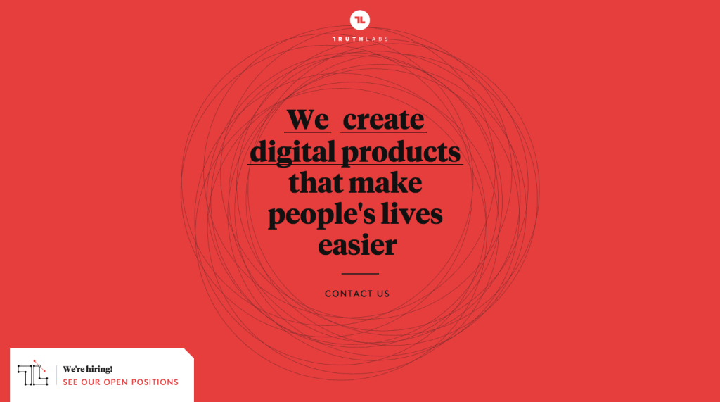 image via http://truthlabs.com/
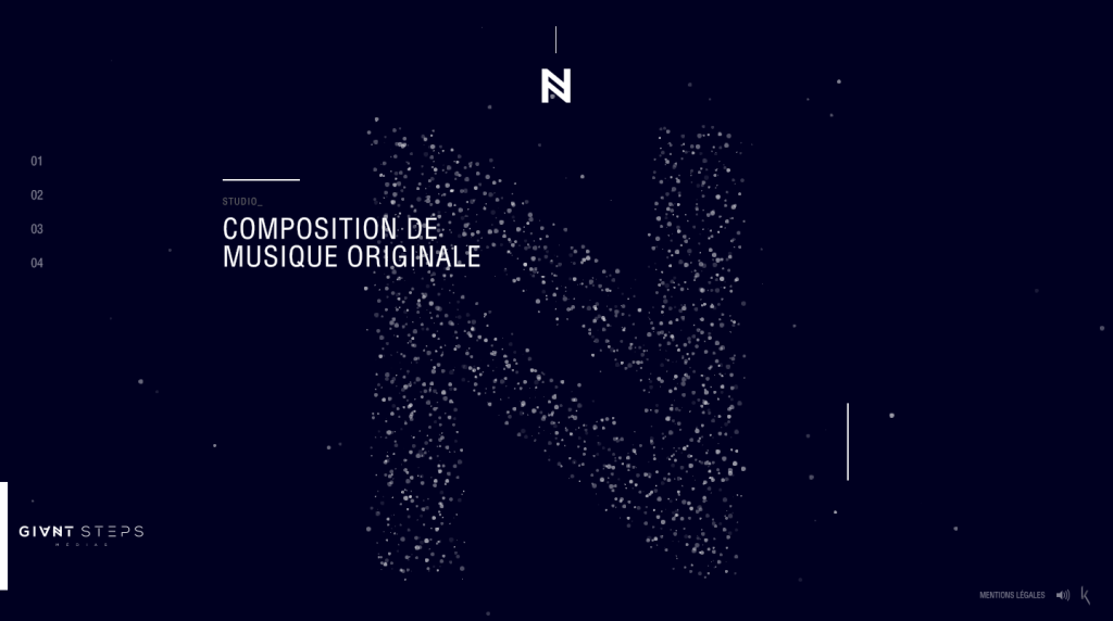 image via http://www.giantstepsmedias.com/
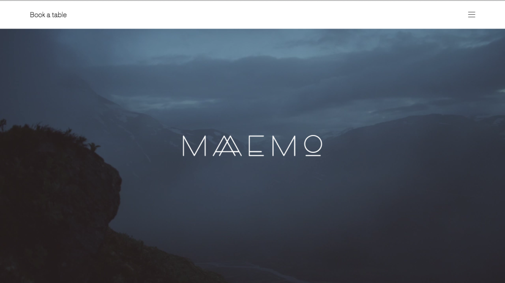 image via http://maaemo.no/