Is Your Company’s Logo Hurting You?
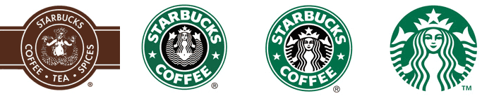
A common facet of all types of advertisements and especially logo design is that they rely on simplicity and cleanliness to convey a message. This is generally because the attention span of most people isn’t one that likes to be held captive for long amounts of time. It is also because there are usually limiting factors on advertising and logos, such as space, time, and our ability to retain information. I often see designs where a designer has tried to meld multiple elements together, or ignored layout basics, and the result is that it just doesn’t work. This is because they are ignoring the basic foundation of a logo design from the start: simplicity and effectiveness from all angles in order to be clean, timeless, and recognizable. As an example take a look at the image included below that shows the logo progressions of Apple and McDonald’s, two globally recognizable companies, over time.

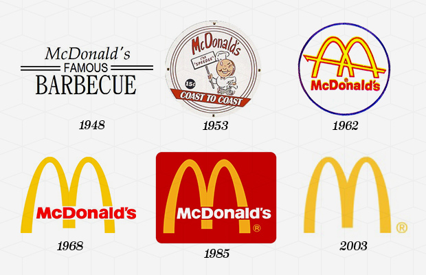
As you can see in the case of both companies, the logos have become simpler over time. The final versions of each are able to stand on their own, sans text, thanks to simple shapes which render them clean and recognizable. The fact of the matter is that we are bombarded with logos and other information at an astounding rate daily. It’s estimated that we on average take in 5000+ advertisements per day. Because of this we have a tendency to ignore complicated and convoluted material. A smart simple design such as the finalized versions of both company’s logos is easier to remember and is much more likely to make an impression on someone in the minimal time they may take to look at it.
Notice also that as each became simpler, they did so without straying away from symbols that have become synonymous with their brand. It’s no wonder that as time goes on and social trends change businesses must adapt. However, in adapting it is important to adhere to the things that have gotten you where you are. Imagine if McDonald’s were to all of a sudden change their logo to something completely different like their 1953 logo and began to implement it at locations around your city. There would most definitely be confusion amongst patrons because most people identify McDonald’s with the golden arches. This is the aspect of timelessness in play. Simple logos are easy to redesign as time goes on while remaining easy to identify.
Here are some of our favorite logos at Marketing Gunslingers
![]()
![]()