Learning Typeface Anatomy Can Help You Become a Better Designer
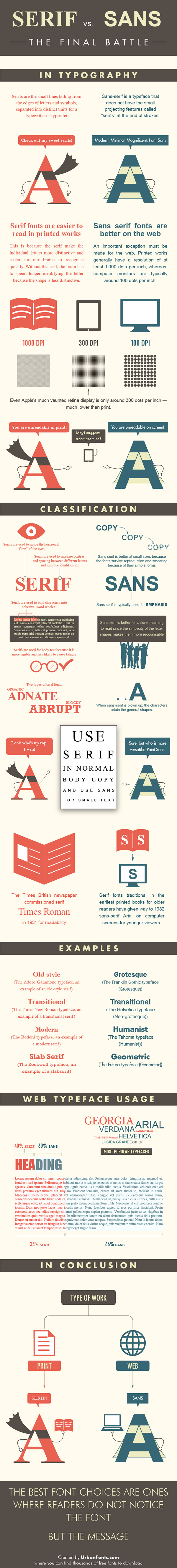
Last week I briefly discussed the importance of font/typeface in design and using the correct font for the desired message. If you took a look at the included infographic, or have ever used a computer before you most likely now have a pretty clear idea of the differences between a serif and sans-serif font. Today I’m going to take that a step further and talk to you about typeface anatomy.
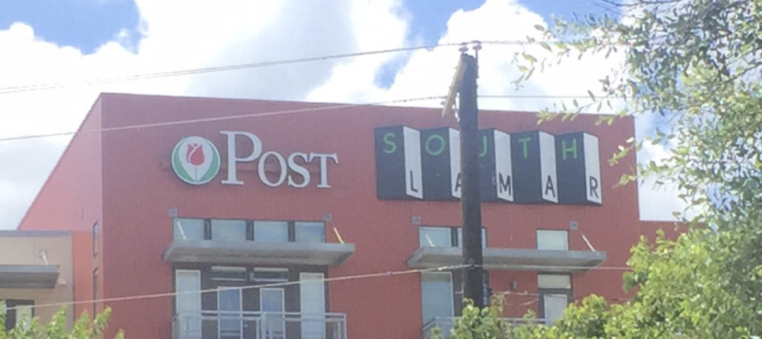
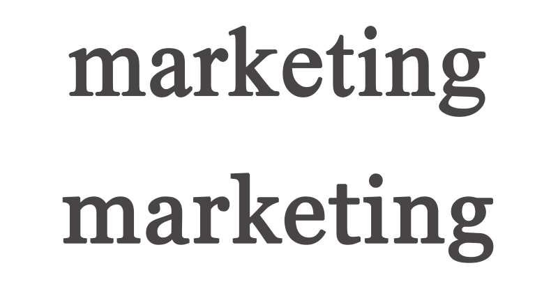
Everyone can tell the difference between the two fonts used by the apartment complex in the first photograph above. Very obviously, one is a serif font while the other is a san-serif, but how would someone who is less experienced know the difference between two similar fonts such as in the second image? They’re both bracketed serif fonts that have teardrop terminals and double-story Gs. The most obvious giveaway is the angle of their upper serifs and the lack of a bilateral serif on the K in the second example. Did any of those terms confuse you? Don’t worry if they did. I’ll be providing a basic guide to typeface anatomy shortly. Also, for anyone wondering, the top is Times New Roman and the bottom is Georgia.
It’s important for designers of both print and digital media to be able to recognize the smallest differences between fonts like this. Developing a vocabulary of basic typeface anatomy informs good decisions, and allows designers to recognize typefaces and fonts in the wild that they can go on to use in their own work. I should note that it isn’t absolutely necessary to memorize the entire list of typeface terminology, but familiarizing yourself with some of the basic concepts and doing your best to pick them out of typefaces/fonts on your own is a great way to train you eye, and make yourself a more effective designer.

Arm
The arm of a character is any upper or lower stroke, either horizontal or slanted that connects to the rest of the character body on one end but not on the other

Ascender
An ascender is the part of lowercase letters such as t, d, f, h, k, l, and b which extends upwards past the x-height.

Bar
A bar is a horizontal stroke in letters such as R, t, A, f, H, and e.
Bowl
The bowl of a character is a curved stroke which created a closed space within a letter such as R, P, d, and b.
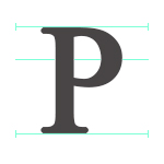
Caps Height
Caps Height is the height of a capitalized letter from the baseline to the top of the character.

Counter
A counter is a closed space within a character such as in the letters q, Q, R, O, o, P, p, a, A, d, D, g, b, and B.
Descender
Descenders are the parts of lower case characters like q, y, p, j, and sometimes g depending on the font, that extend below the baseline.

Ear
The ear is the small protruding stroke attached to the top of a lowercase g.

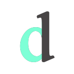
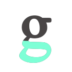
Link
A link is the part of a lowercase double-story g that connects the two bowls.
Loop
A loop refers to the bottom bowl of a double-story g

Serif
A serif is a stroke protruding from the ends of the major strokes with make up a letter. There are two kind of serifs: bracketed and unbracketed. Bracketed serifs have supporting curves that connect the stroke to the serif such as in the example to the right. Unbracketed serifs rather, are attached at 90 degree angles.

Shoulder
The shoulder is a curved stroke that advances downward from the stem in letters like h, n, and m.
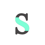
Spine
The spine is the main curved stroke of an S.

Spur
A spur is a small protrusion away from the main stroke of a capital G.
Stem
The steam is the main, usually vertical stroke of a character.

Stress
Stress refers to the direction of thickening in a curved stroke. It is most often seen in characters that have counters and bowls.
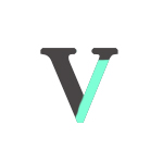
Stroke
A stroke is a straight or curved diagonal line that is separate from the stem such as in N, M, or Y. In characters that have two diagonals such as A and v, the first line is the stem and the next, the stroke.

Swash
A swash is a decorative replacement for a terminal or serif that is often found in script style typefaces. They are often used to indicate the beginning of a sentence or paragraph.

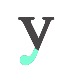
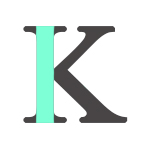
Tail
A tail is a term referring to the descender of letters like Q and sometimes R and K. Often decorative, a tail can also be used to describe the descenders of the characters j, g, y, q, and p depending on the font used.

Terminal
The terminal is the end of a stroke which does not include a serif.

Tittle
A tittle, also know as a dot, is the small mark above the letters j and i.
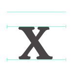
X-Height
X-height refers to the height of lowercase letters, most notably x, without including ascenders or descenders.